Table of Contents
ToggleIn the chaotic world of design, finding balance is like trying to juggle flaming torches while riding a unicycle. It’s a delicate dance between aesthetics and functionality that can make or break a project. Without it, designs can end up looking like a toddler’s finger painting—colorful but utterly confusing.
Understanding Design Balance
Design balance involves distributing visual weight evenly across a layout. Achieving this balance requires skillful consideration of elements like color, space, and typography.
Definition of Design Balance
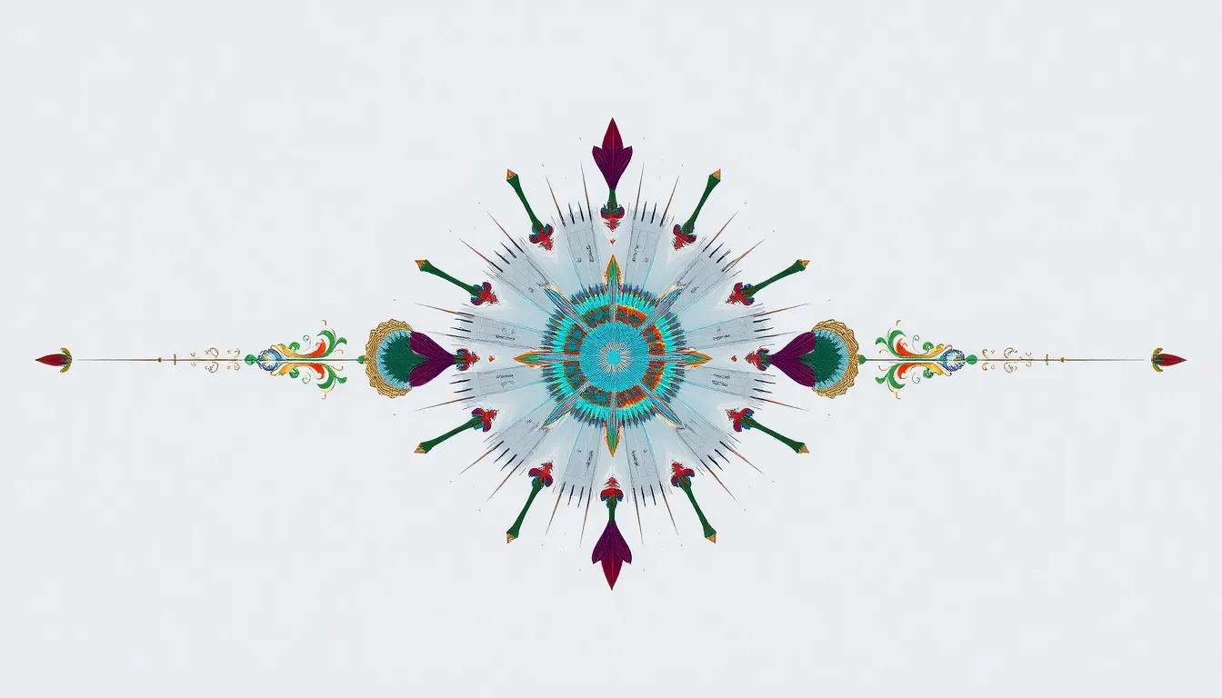
Design balance can be categorized into two main types: symmetrical and asymmetrical. Symmetrical balance occurs when elements mirror each other along a central axis, promoting stability. Asymmetrical balance involves arranging dissimilar elements to create a sense of equilibrium, often resulting in a dynamic, engaging layout. Design balance focuses on harmonious composition that pleases the eye while maintaining functionality.
Importance of Design Balance
Achieving design balance enhances user experience significantly. Balanced designs guide viewers’ focus and create a visually appealing atmosphere. When balance is present, designs enable easier navigation and improved comprehension of content. A lack of balance can lead to confusion, detracting from the message the design intends to convey. Prioritizing balance fosters clarity, which ultimately supports effective communication of ideas and enhances overall aesthetic appeal.
Types of Design Balance

Understanding the types of design balance enhances a designer’s ability to create impactful work. Three primary forms exist: symmetrical, asymmetrical, and radial balance.
Symmetrical Balance
Symmetrical balance features elements that mirror each other along a central axis. This type promotes a sense of stability and harmony, appealing to viewers’ need for order. Designers often use symmetry in layouts to create traditional and formal aesthetics. Examples include websites and brochures where text and images align evenly. The predictable arrangement helps communicate a clear message, allowing audiences to navigate easily.
Asymmetrical Balance
Asymmetrical balance involves distributing dissimilar elements unevenly to achieve harmony. This approach creates visual interest and energy, engaging viewers in a dynamic experience. Designers can use varied shapes, sizes, and colors to create contrast, drawing focus to key elements. Examples of this type include modern websites or artistic posters where balance arises from tension and arrangement rather than duplication. The result keeps the audience engaged while maintaining effective communication.
Radial Balance
Radial balance arranges elements around a central point, radiating outward. This method creates movement and draws the viewer’s eye towards the focal area. Designers often apply radial balance in logos or circular layouts, which enhances the perception of unity and wholeness. The structure engages viewers while fostering a sense of connection among the components. Examples can be seen in web design and print materials where a central theme guides surrounding elements.
Principles of Achieving Design Balance
Achieving design balance requires understanding fundamental principles that guide its application. These principles help create layouts that are both functional and aesthetically pleasing.
Scale and Proportion
Scale and proportion refer to the size relationships among design elements. When elements relate correctly in size, they create harmony. Designers should consider how large elements interact with smaller ones to avoid overwhelming the layout. For instance, a large image paired with small text might dominate the visual space and draw too much attention. Conversely, a well-proportioned layout allows each element to maintain its importance without competing for attention. Effective scale and proportion enhance overall balance by ensuring a cohesive design that feels intentional.
Visual Weight Distribution
Visual weight distribution involves arranging elements so that they are easily perceived as balanced. Every design component carries a certain visual weight, influenced by factors such as color, shape, and size. Lighter colors seem less heavy than darker ones, while intricate shapes carry more weight than simple ones. By carefully placing heavier elements alongside lighter ones, designers can achieve equilibrium across the layout. This distribution guides viewers’ attention and creates a sense of stability. Strategically balancing visual weight leads to effective designs that foster engagement and clear communication.
Tools and Techniques for Design Balance
Achieving design balance involves utilizing specific tools and techniques that streamline the creative process. Designers leverage various software options and practical strategies to create visually harmonious and effective layouts.
Design Software Options
Numerous design software programs assist in achieving balance. Tools like Adobe Illustrator and Adobe Photoshop offer advanced features for precise manipulation of elements. Sketch presents streamlined tools for web and interface design, while Figma focuses on collaborative design workflows. Canva provides templates and easy-to-use features for quick design solutions. Each option caters to unique design needs, enhancing efficiency and effectiveness.
Practical Techniques for Balance
Several practical techniques help designers establish balance in their work. Employing a grid system organizes elements cohesively, fostering clarity. Utilizing white space enhances breathing room, preventing overcrowding of elements. Color theory guides the use of hues and contrasts to create visual interest. Adjusting scale among elements ensures that no single item dominates the layout. Implementing these techniques aids designers in creating visually appealing and user-friendly experiences.
Achieving design balance is essential for creating effective and engaging layouts. By understanding and applying the principles of symmetrical, asymmetrical, and radial balance, designers can craft experiences that are both visually appealing and functional. The strategic use of scale, proportion, and visual weight allows for a harmonious distribution of elements, guiding viewers’ attention seamlessly.
Utilizing the right tools and techniques further enhances the design process. With the right software and methods, designers can simplify their workflow while ensuring clarity and stability in their creations. Ultimately, a well-balanced design not only captivates the audience but also communicates ideas clearly, making it a crucial component of successful design strategies.


