Choosing the right interior color scheme can feel like picking the perfect outfit for a first date—one wrong move and it’s an awkward disaster. But fear not! With a splash of creativity and a dash of confidence, anyone can transform their living space into a vibrant oasis or a serene retreat.
Understanding Interior Color Schemes
Selecting an interior color scheme greatly influences the ambiance of a space. This choice significantly impacts mood and perception within a home.
The Psychology of Color
Colors evoke emotions and can affect how people feel in a room. Red often energizes, while blue tends to calm. Green promotes balance, fostering a connection with nature. Yellow brings warmth and cheerfulness. Each shade communicates unique sentiments, influencing human behavior. A well-chosen palette creates feelings of comfort or excitement, shaping a visitor’s experience. Designers frequently consider these psychological effects when suggesting color schemes for homes.
Color Theory Basics
Color theory encompasses principles that guide color selection for interiors. The color wheel divides colors into primary, secondary, and tertiary categories, providing a visual relationship. Complementary colors rest opposite each other, creating contrast and vibrancy. Analogous colors, positioned next to each other, produce harmony. Triadic schemes involve three evenly spaced colors, offering balance. Understanding these basics allows homeowners to combine shades effectively, enhancing visual interest. Effective color combinations can unify various elements within a space, promoting a cohesive design.
Popular Interior Color Schemes

Selecting an interior color scheme can transform a space. Various schemes cater to different aesthetics and moods.
Monochromatic Color Schemes
Monochromatic color schemes utilize variations of a single hue. Each shade creates depth and visual interest without overwhelming the senses. A light blue paired with navy can evoke calmness, while pale greens alongside forest greens promote relaxation. This approach simplifies coordination since all shades belong to the same family. Texture plays a crucial role in enhancing the overall look, making fabrics and materials essential for creating layers.
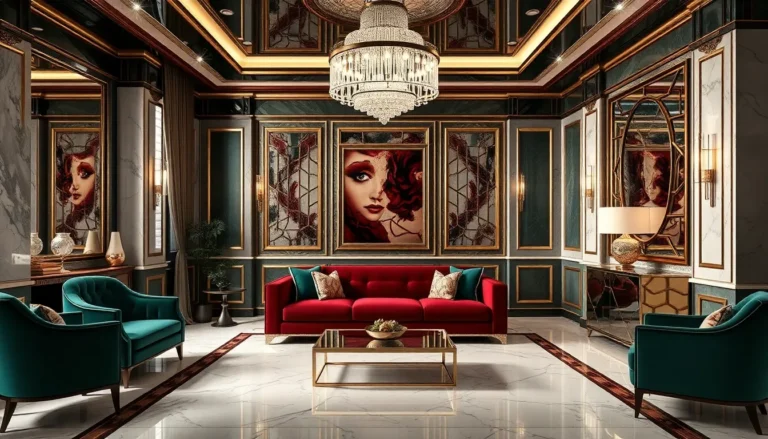
Complementary Color Schemes
Complementary color schemes feature colors opposite each other on the color wheel. These combinations generate contrast and vitality. For instance, pairing orange with blue creates an energetic atmosphere. While they draw attention to each other, balance is key to avoiding an overwhelming effect. Using subdued tones can soften the impact, such as using a muted orange with a rich navy. As a result, these schemes often work well in spaces meant for socializing.
Analogous Color Schemes
Analogous color schemes employ colors that sit next to each other on the color wheel. These combinations create harmony and often produce serene environments. A blend of yellow, yellow-green, and green can invigorate a space while maintaining cohesiveness. Positioning one color as the dominant hue while using the others as accents enhances visual appeal. The subtle transition between colors fosters a tranquil atmosphere, ideal for relaxation areas within a home.
Choosing the Right Color Scheme
Selecting an ideal color scheme involves thoughtful consideration of various factors. Understanding the room’s function significantly influences color decisions.
Considering Room Functionality
A living room benefits from warm, inviting colors like soft cream or light taupe to encourage conversation. For bedrooms, serene hues such as pale blue or gentle lavender promote relaxation and restful sleep. Kitchens often thrive with bright shades like sunny yellow or crisp white, energetically stimulating the cooking experience. When focusing on home offices, cool shades such as green or gray create a productive environment. Finally, bathrooms usually favor lighter tones, enhancing cleanliness and tranquility.
Matching with Furniture and Decor
Harmonizing color with existing furniture and decor enhances visual coherence. Neutral walls like soft gray or beige serve as a versatile backdrop for colorful furniture pieces. Bold accent colors, such as deep navy or emerald green, can complement wood tones or metal finishes stylishly. Choosing paint shades that echo fabric patterns conveys a sense of unity and sophistication. Accessories play a role as well; coordinating decor with colored cushions, rugs, or artwork can tie the entire room together effectively. Color choices should also respect the lighting, as natural light can alter how colors appear throughout the day.
Trends in Interior Color Schemes
Current interior color schemes reflect diverse trends that enhance spaces through functionality and style. Bold and pastel colors lead the way, influencing aesthetics and mood.
Bold Colors in Modern Design
Bold colors gain popularity for their striking impact. Designers increasingly use energetic hues like electric blue, vibrant orange, and deep emerald green to create focal points. These colors energize spaces, drawing attention and setting a bold tone. Furniture pieces often showcase rich colors, while accent walls feature daring shades to emphasize design elements. Homeowners appreciate the versatility of bold colors, as they work well in both modern and traditional settings.
Pastel and Neutral Trends
Pastel and neutral colors thrive in contemporary interiors. Soft shades like blush pink, mint green, and pale blue introduce tranquility and elegance to any space. Neutrals, including beige, gray, and off-white, provide a versatile backdrop, allowing for creative expression through decor. These calming tones contribute to a serene environment, making them ideal for bedrooms and living areas. Balanced combinations of pastel hues and neutral shades create a harmonious feel, appealing to those aiming for understated sophistication.
Choosing the right interior color scheme can transform a space into a personal sanctuary. By understanding the emotional impact of colors and the principles of color theory, homeowners can create environments that resonate with their lifestyle and preferences. Whether opting for bold hues to energize a room or soft pastels for a calming effect, the key lies in thoughtful selection.
Trends continue to evolve, offering a variety of options that cater to different tastes. By harmonizing colors with existing decor and considering the effects of lighting, individuals can achieve a cohesive and inviting atmosphere. Ultimately, the right color scheme not only enhances the aesthetic appeal but also elevates the overall mood of a home.